Introduction
We may all agree that “life is too short to have boring room colors!” Everyone aspires to have a tastefully furnished home in hues that reflect their individuality. Interior design and color psychology can help with that. Whether or not he wishes to transform his home into an amazing work of art is up to him. Nonetheless, one can decorate his home with bright, muted, comforting colors.
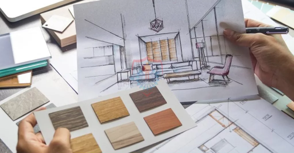
The interior design industry is becoming increasingly popular worldwide, especially in Pakistan, thanks to the growing trend of interior design. Nowadays, everyone wants to be in the race to create amazing and hospitable interior design. Color psychology is incorporated into the interior design concept. Using muted hues calms you down and bright colors might energize you.
Let’s explore the fascinating concept of the color wheel and how different hues affect your feelings. This blog will give readers advice and inspiration on how to use color according to mood and personal preference. It will also benefit people who are considering a career in interior design.
Read More: How Can I Make My Room Cozy Without Spending Money
What is Color?
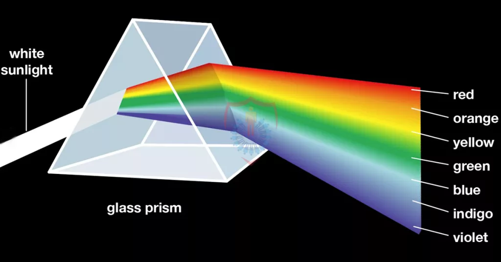
First, let’s review the fundamental idea: “An object’s color is determined by the different light qualities that it emits or reflects.” You need light in order to see color. Certain colors are reflected off of an object when light glints on it, whereas other colors are absorbed by it. Only the colors that are reflected after that are visible to the unaided eye.
Humans have a tendency to choose different colors based on personal preference, similarity, personality, and taste. Each color has several varieties and tints.
What is Color Psychology?
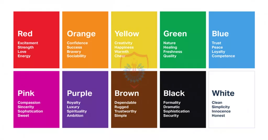
Color psychology can be defined as “a collection of colors that influence human emotions and behavior.” There is a large body of research on color psychology and its supposed profound influence on emotions, behavior, and thought processes. Using diverse colors in the interior design of your home creates a different atmosphere. This atmosphere elevates or depresses you depending on how you feel.
It’s interesting to note that when it comes to home décor, professional interior designers today use and carry out appropriate research. It’s just that people’s overall mindsets are greatly influenced by colors. It’s simply because people’s overall mindsets are greatly influenced by colors. Additionally, varied hues give a space a different atmosphere.
What is a Color Wheel?
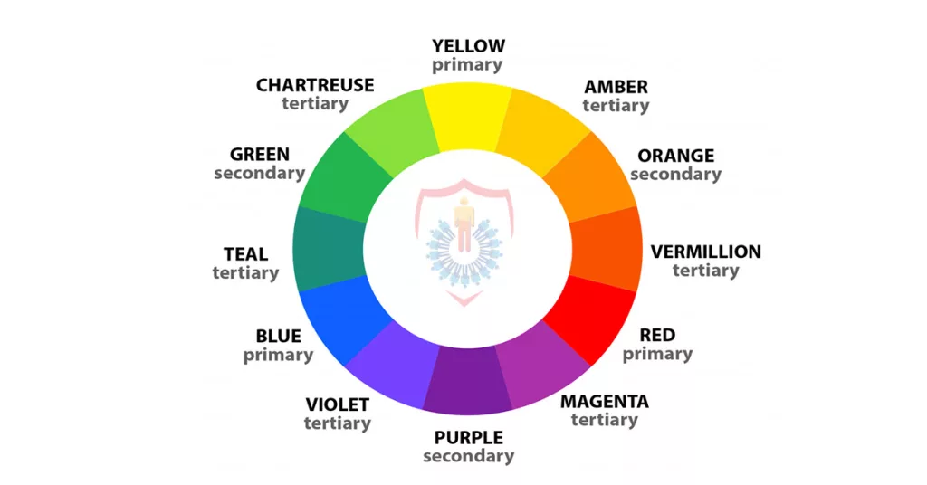
Now for one of the most fascinating sections of this blog: the color wheel is a commonly used tool for grouping colors together in a color scheme. The color wheel is, as its name implies, “the arrangement of colors in a wheel or circle.” Interior designers use the color wheel.
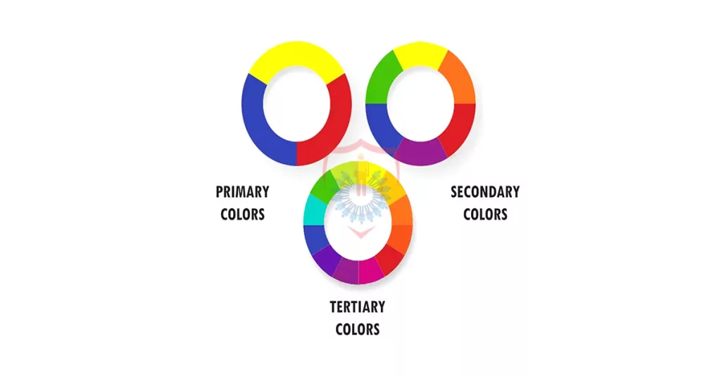
Twelve hues make up a basic color wheel, and they are grouped as follows:
- Three primary colors: blue, yellow, and red
- Three Secondary Hues: Violet, Green, and Orange
- Six Tertiary Colors: Red, Orange, Yellow, Green, Blue, Violet, and Red-Violet
In addition to these fundamental hues, an updated wheel could include certain special hues that result from the tertiary hues. The colors in the wheel are always ordered in the same VIBGYOR sequence, regardless of how many colors there are.
In this case, VIBGYOR stands for “Green-Yellow-Orange-Red-Violet-Indigo-Blue.”
Rules of Picking a Color Combination
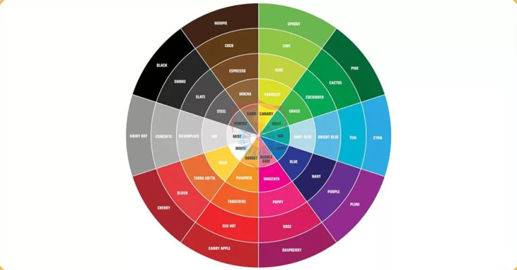
People increasingly hire interior designers to renovate their homes in this period of increasing modernity and aesthetics. Next, in order to find the ideal color combination, the designers consult a color wheel. To select outstanding pairings, there are a few set rules.
Here are three incredible pairings that work really well together:
Combination 1:
Monochrome: Any combination of one color’s tones, shades, or tints. As an illustration, consider raspberry, rose, and bubblegum (various pink tones).
Combination 2:
Analogous: Two or more hues on the color wheel that are next to each other. Orange, yellow-orange, and yellow are a few examples.
Combination 3:
Complementary colors, sometimes referred to as contrasting colors, are those that are precisely opposite one another on the color wheel. Red and green are two examples.
The aforementioned combinations are increasingly being used by interior designers because to their increased grasp of psychology. These combinations assist them in determining which colors would best fit their clients’ demands.
What is Color Psychology and How Does it Relate to Interior Design?
The field of interior design heavily relies on the theory of color psychology. This is because a person wants to feel at ease in the house they purchase or seek to improve. It is now the designer’s responsibility to comprehend the client’s psychology and select the most appropriate color schemes for him. Since colors influence a significant aspect of life.
In addition, home is ultimately a place where a person must spend the most of their days. The colors chosen for the space should make the person feel at home and meet his needs. Individual differences in how each person responds to color also contribute to this friendly atmosphere. Therefore, it is imperative that designers perform adequate research in advance for each customer.
Some examples of applications for color psychology are listed below:
- Wall color
- The hue of the lights
- ornamental elements
- Furniture color combination
What Emotions Do Colors Trigger?
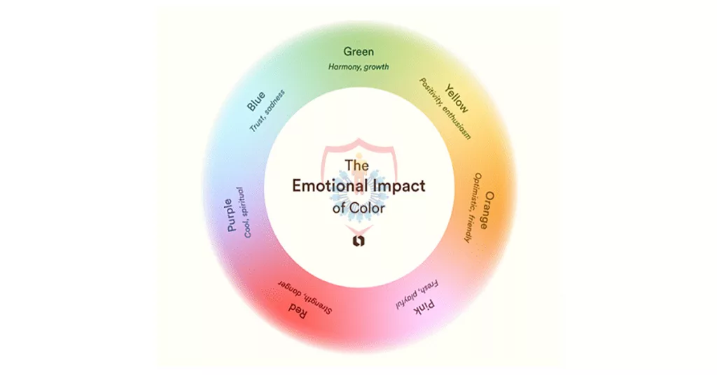
Now, some readers may find it surprising to learn that specific emotions can be evoked by specific hues. Yes, this is accurate. Numerous investigations into this phenomena have revealed a direct correlation between exposure to color and emotions. Your attitude can be instantly lifted by colors.
There are two types of color tones: warmer and colder.
Cool hues like purple, green, and blue are related to:
- Peaceful
- Serenity
- Unwinding
Warm hues like orange, yellow, and red are connected to:
- Happiness
- Warmth
- Energies
How to Use Color Psychology in Interior Design
The common colors used in interior design and their various psychological effects will be the subject of this blog part.
The seven colors listed below should be discussed in regard to interior design and the psychology of people:
- Pink
- Blue
- Black
- Brown
- Verdant
- Yellow
- Earthy tones of red and red
1: Blue
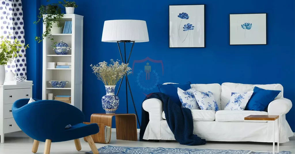
One of the three fundamental hues, blue is frequently employed by interior designers to infuse their designs with personality. It is at the extreme end of the range and gives the area a hip vibe. In terms of temperature, it is considered the coolest hue of all.
Blue in Interior Design: A Study in Color Psychology
It’s thought that this color will help you relax and get your blood pressure back to normal. Because of this advantage, interior designers incorporate this hue into the design of bedrooms and bathrooms. The reason for this is that individuals utilize these two locations to unwind, and employing blue in these settings can lower pulse rate.
In interior design, the color blue is utilized in:
- Pieces of furniture
- Walls in bathrooms
- ornamental elements
- Wooden crate storage
Blue’s Psychological Effects: The deeper blue tones elicit the following emotions:
- Loyalty
- Dependability
- Trust
But the paler blue tones arouse the following emotions:
- Calm
- serenity
- Unwinding
2: Pink
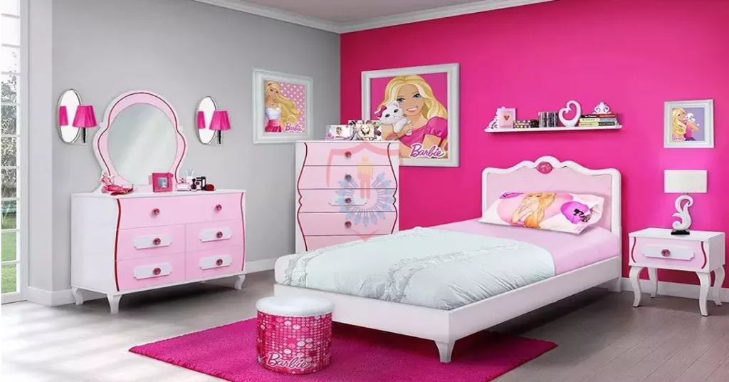
Pink is frequently connected to femininity. Aside from that, though, pink hues are frequently utilized by interior designers these days to improve the atmosphere of a space or house. Its adaptability is the reason this hue is utilized.
Pink and Color Psychology in Interior Design
Your room can be transformed in unexpected ways by using pink interior design. As a subdued version of red, pink is comforting, calming, and passionate. Although people frequently associate pink with being girlie, pink has many other uses.
Pink and Color Psychology in Interior Design
The interior design makes the following usage of the color pink:
- Sofas
- Beds
- Cushions
- Accent pieces
Pink’s Psychological Impact
The following qualities are evoked by the hue pink:
- Security
- Calmness
- calms hostility or rage
3: Black
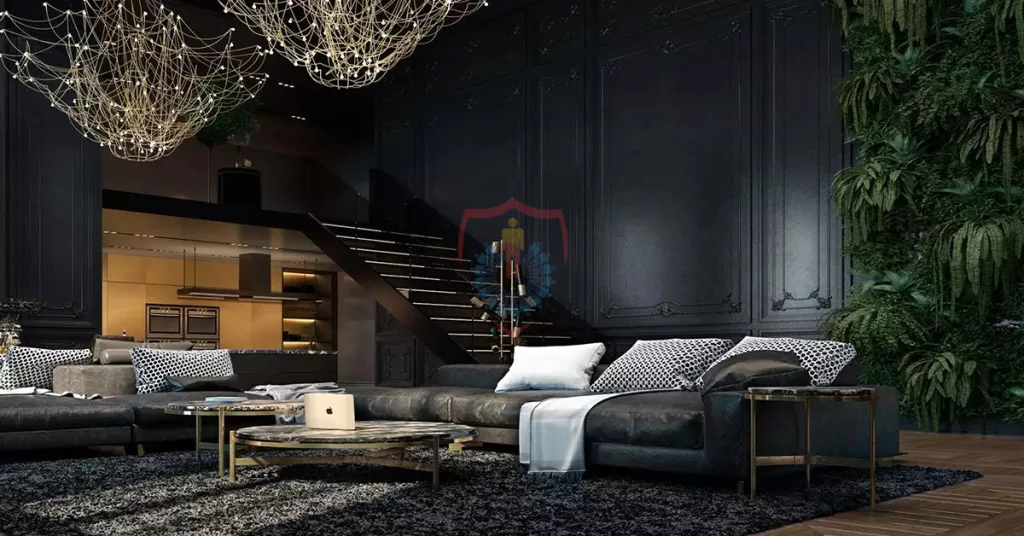
It’s likely that you’ve heard the saying “When in doubt, go with black!” This is the general power that the color black possesses. It is regarded to be the most mysterious color of all. It also possesses the ability to absorb other hues. Because of its relevance and resemblance to Gen Z and Millennials, interior designers are increasingly utilizing this hue extensively in their designs.
Black and Color Psychology in Interior Design
Black is frequently associated with power, refinement, and elegance. The appropriate color scheme, like white, will give your design a timeless feel. Nowadays, it’s common for people to decorate their homes with this color.
Interior Design Using Color Psychology Using Black: When it comes to interior design, black may be utilized in:
- Couches
- Walls
- Lamps
- Rugs
The Psychological Impact of Black
The following emotions are evoked by the color black:
- Integrity & Safety
- Direction
- Self-Regulating
- Self-Discipline
4: Brown
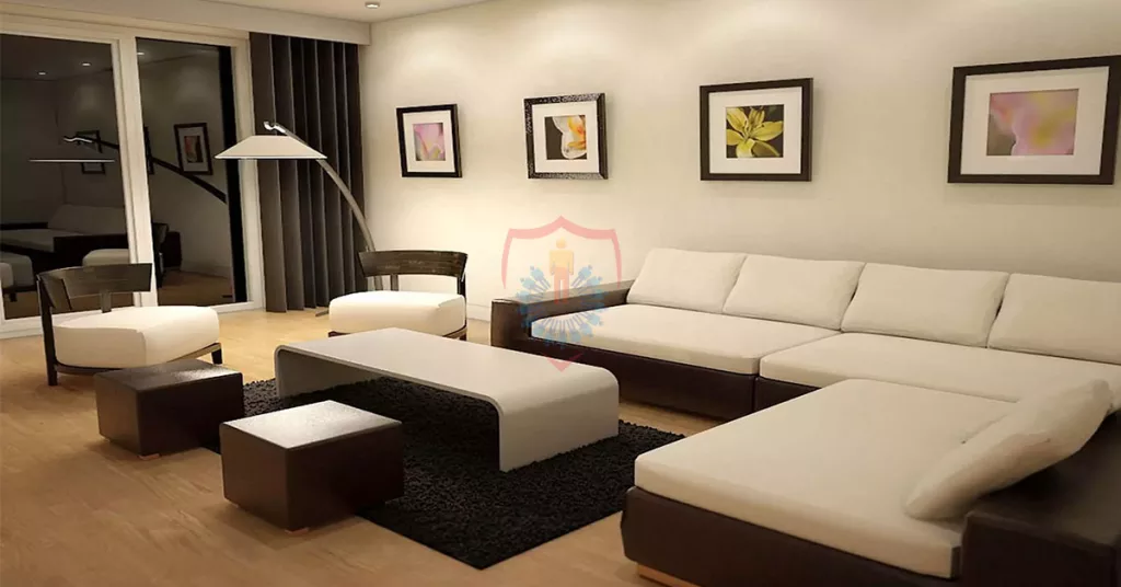
This hue deviates from red in a softer and lighter way. Brown’s natural tone inspires a calming sense, making it an excellent choice for synchronizing different elements in vast rooms. Similar to black, it’s also utilized by interior designers these days to create a minimalist space in a home or room.
Interior Design Use of Color Psychology By Using Brown
Feelings of safety, relaxation, and tranquility are associated with brown. Brown offers hospitable interior spaces that are ideal for cozy winter evenings in and keeps us grounded.
Brown in Interior Design: A Study in Color Psychology
In interior design, the color brown is utilized in:
- Floor
- Walls
- Tables
- Side Lamps
Psychological Effect of Brown
The following emotions are evoked by the color brown:
- Security
- Safety
- Power
- Dependability
Impact of Different Colors on Psyche of Employees
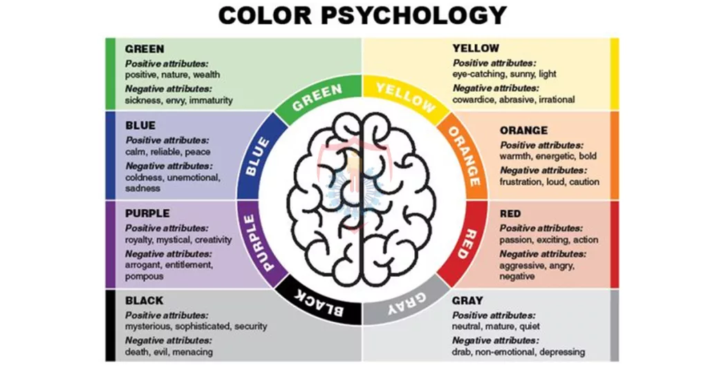
We’ve now covered how interior designers employ a variety of colors in a space’s decorating to evoke a certain feeling. It is also possible to argue that the commercial arrangements employ color to evoke particular emotions in the workplace.
The following colors and how they affect workers’ mental health in a business setting:
- Orange is a mood enhancer.
- Green is thought to foster creativity.
- Blue is utilized to create a calming atmosphere.
- When anything needs your immediate attention, use red.
How Cultural Differences can Influence Color Associations?
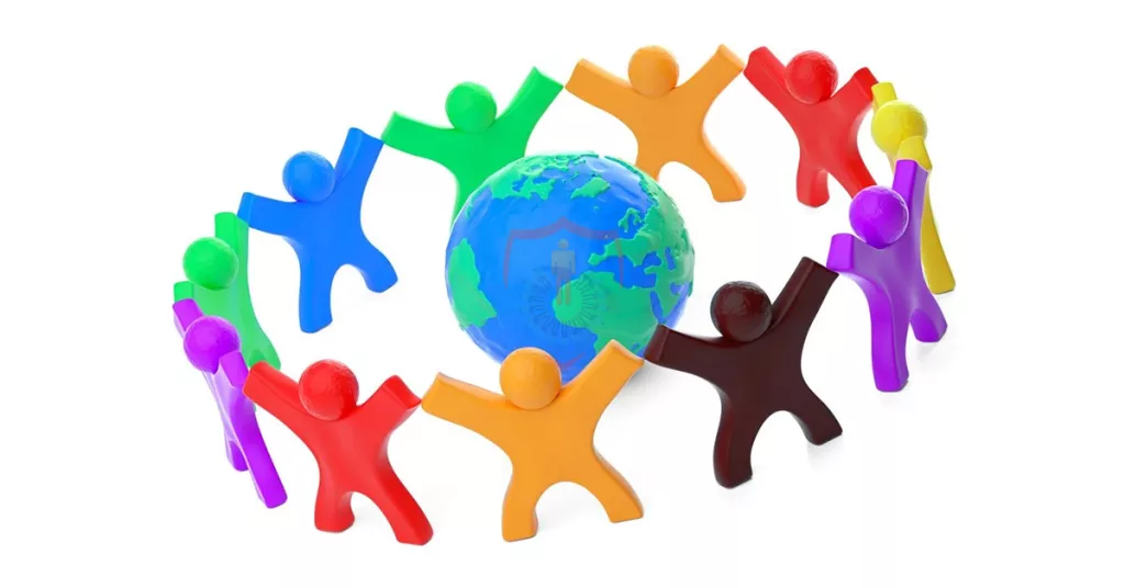
In different cultures, different hues have distinct significance. Every culture has its own way of understanding color. This may give rise to the potential for misinterpretation. A person from a different culture may interpret a hue differently and use it for different purposes. It is crucial to understand this problem, for this reason.
How Can Cultural Variations Affect Color Associations?
As an illustration,
- It is connected to luck and wealth in Eastern cultures.
- Red is frequently connected to passion and love in Western cultures.
- White is typically connected with funerals and grief in many Eastern cultures.
- White is frequently connected to innocence, cleanliness, and purity in Western societies.
- This is the idea behind color psychology as it relates to interior design. Several colors can be used, depending on personal preference and taste.
FAQs
Some common questions regarding the application of color psychology in interior design are listed below:
Q1: Describe interior design?
The answer is that an interior design concept serves as the main idea around which all other design aspects revolve.
Q2: Is color psychology defined?
It is described as a collection of colors that influence people’s emotions and conduct.
Q3: What what is a color wheel?
The arrangement of colors into a wheel or circle is called a color wheel.
Q4: How many colors are there in the color wheel?
The twelve hues that make up a basic color wheel are grouped together as follows:
- Three primary colors: blue, yellow, and red
- Three Secondary Hues: Violet, Green, and Orange
- Six Tertiary Colors: Red, Orange, Yellow, Green, Blue, Violet, and Red-Violet
Q5: Which three color combinations are there?
The three fundamental color schemes are complimentary, analogous, and monochromatic.
Al Sadat Marketing please contact 0331 1110005 or visit https://alsadatmarketing.com/


